Category

Latest News

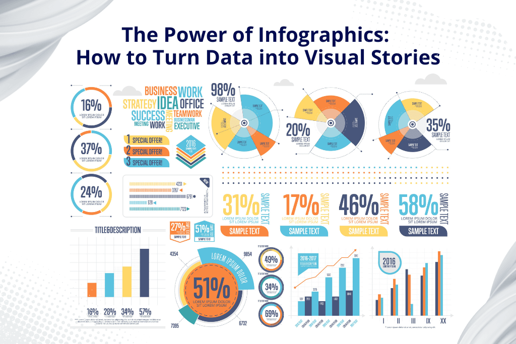
The Power of Infographics How to Turn Data into Visual Stories

The Power of Infographics: The Way to Turn Data into Visual Stories

By Latest News No Comments

Data floods our digital lives, it is no longer about the extraction but understanding or retaining that extracted knowledge. Infographics are an effective combination of visual storytelling and data visualisation-painstakingly transforming a mess of information into visually engaging narratives that grab your attention and simplify complex ideas, leaving an impression more than most does.

A good infographic can really summarise research very well, summing up much thought work into one picture. One views in which an infographic shines is that it definitely understands to give trends and patterns emphasis. In a world of short attention spans, infographics cut through the barriers because they make the really complex simple to understand.

We’ll talk about the art and science of creating effective infographics. We will dig into the key principles of design, data visualisation, and storytelling, providing practical tips and techniques to help you harness the power of infographics.


What is an Infographic?

It is visual storytelling that exploits the mighty power of images to carry complex information into a rather less complicated and even engaging approach. It’s a richly crafted visualisation that interlocks all those elements with the following.

  • Images: These are the most general, using as simple icons, and others as more complicated illustrations helping to represent a concept.
  • Charts and Graphs: These numerical representations give straightforward and clear-cut data comparison, trends, and comparisons.
  • Minimal Text: Strategic use of words, as the term often engages through short descriptions or labels, makes it possible to maximise the visually rich effect.

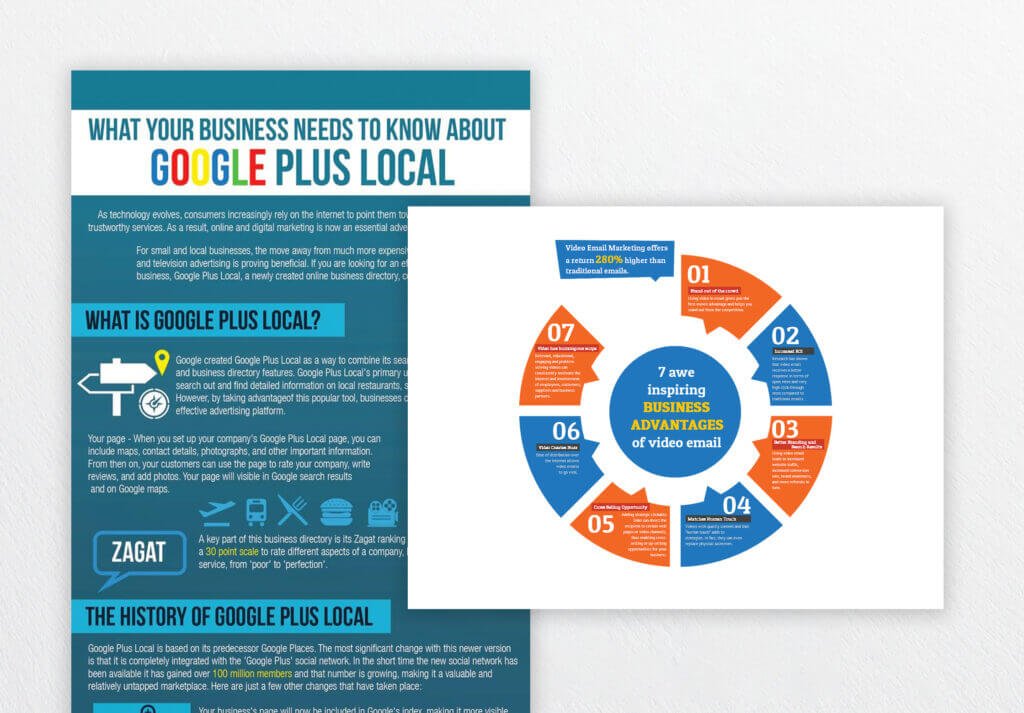
Infographics Image Sample

Combining all these elements well, infographics are a beautiful narrative with an aesthetic and informative touch. This style makes it easier for viewers to finally get those key points and remember information, since it’s all so much easier.


Why Are Infographics Powerful?

1. Enhanced Understanding

  • Visual Impact: A good infographic can turn the flat, text-based report into a real piece that leaps off the page at one glance and grabs the reader immediately.
  • Complexity Made Easy: While a statistical report on climate change may be very complex, an infographic can break out key trends and data points in a way that can be easily understood.
  • Improved Retention: According to research, the human brain retains information better when presented in a visual format. An infographic ensures that viewers remember the key concepts more easily.

2. Effective Communication

  • Clear and Concise: Because infographics present key messages using minimal texts, they are an effective means of presenting complex information in a clear and concise manner.
  • Global Language: Images do not have language, hence infographics provide an excellent means for a multilingual global audience.
  • Engaging Display: An infographic would always arouse curiosity over the subject and prompt readers to read more about it.

3. Telling Data

  • Storytelling Ability: Infographics makes data come alive. For instance, if one is talking about internet history, it is represented using the timeline of all the major events that occurred.
  • Persuasive Power: Infographics can persuade people and bring about actions if done at the right level. The effective use of infographics can be applied to any cause, a product, or educating the public.


Best Examples of Successful Infographics

  • Data Journalism: Infographics are used mostly when telling complex data in a lucid manner. One good example of this use is The New York Times, which uses plenty of infographics in visualising most trends in politics, economics, and social issues.
  • Marketing and Advertising: Infographics can be used to advertise a product or service, explain complicated information, and tell stories of your brand.
  • Education and Training: To present complex ideas graphically engaging. For example, a science teacher will use an infographic to try teaching his students about the water cycle.
  • Non-profit Organisations: Show awareness about social issues and raise donations.

Knowing the power of infographics and the guidelines, you can easily create your visually attractive and informational content that will impress your audience and satisfy your goals in communication.


Steps to Create the Most Effective Infographics to Educate, Engage, or Inspire Your Audience

1. Define Your Goal

Identify Your Audience: Who are you trying to reach? Are they experts in the field, or is it a general audience? Understanding your audience will help you tailor your message and visual style. Define Your message, what is the main thing you will want to tell? Limit your message to just a few words or ideas.

2. Gather Your Information

Gather Your Facts: Make sure your facts are accurate, timely, and pertinent. Arrange your information, arrange the information in a coherent and easy to access manner. You may need to use a mind map or outline to explain how the information flows.

3. Choose Your Graphics

Using appropriate form of chart and graph: Use the right graph for your data. For example, use bar charts when one is comparing categories and one want to display trends with time. Design attractive graphics, use a consistent colour scheme and the same font style for your infographic. Further, use icons, illustrations, etc., to make the overall design click.

4. Write a coherent story

Develop a Storyline – organise your information into a coherent narrative, beginning with a strong introduction that leads through the body to a climax, and concludes satisfyingly. Strong visual hierarchy, guide the viewer’s eye through the infographic using visual cues such as colour, size, and placement.

5. Keep It Simple

Use minimal text to write in clear, concise language. Do not use jargon or technical terms that your audience might not understand. Focus on key points and identify the most important information. Use a combination of text and images to drive the point home well.

6. Test and Refine

Get comments or other people’s ideas for changes that need to be made. Ask your friends, colleagues, or potential audience members to look at your infographic and ask for comments. Iterate and refine the infographic by changing details such as colour, font, and layout to increase clarity and impact.


Tools Used in Making Infographics

There are numerous tools that you can use online as well as offline for bringing your infographic ideas into reality. Here are a few popular ones:

Online Tools:

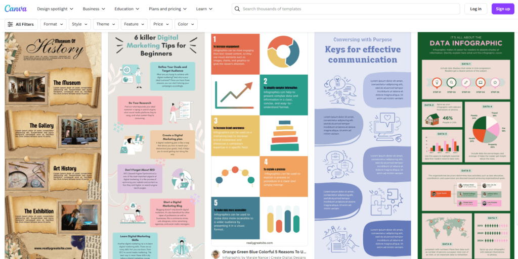
  • Canva: All under one roof, with free templates on icons, fonts, etc. Awesome for a beginner and a pro alike. Very user-friendly.

Canva Infographics Template Samples

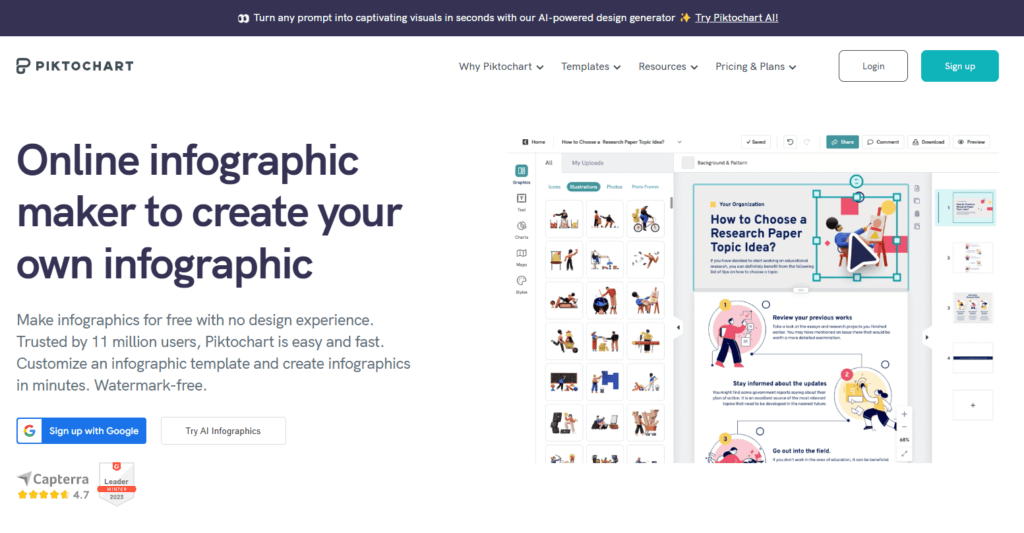
  • Piktochart: A cloud-based tool that removes the hassle of an infographic in the easiest drag-and-drop interface.

Piktochart Infographics Template Samples

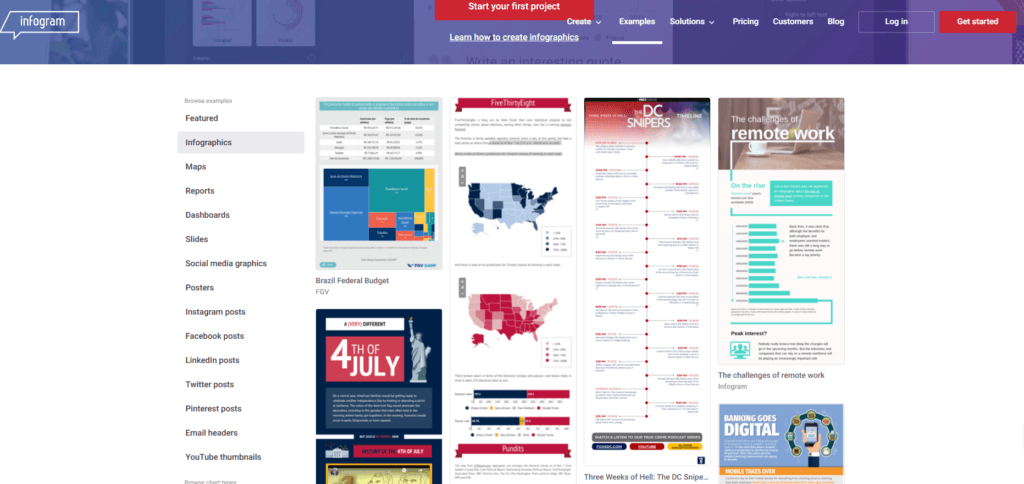
  • Infogram: An infographic-making tool that lets you create all sorts of data visualisations in a chart, graph, or map.

infogram Infographic Template Samples

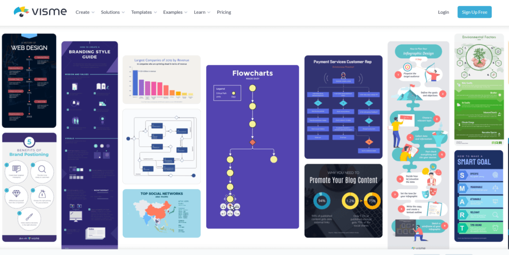
  • Visme: Great all-around tool for making interactivity in infographics, presentations, and reports

Visme Infographic Template Samples

Offline Tools:

  • Adobe Illustrator: The professional-level vector graphics editor will give you the highest amount of control over your design elements.
  • Adobe Photoshop: This image editing software is a full-featured one, capable of helping to create excellent infographics visuals.
  • Microsoft PowerPoint: Being a general-purpose presentation application, it can also be effectively used for simple infographics.

Another option is to let graphic designers, like GC Graphic Design and Print, take care of the design process for you.

The right decision will make it easier for you to simplify your process of infographic creation and then produce high-quality visuals that express your message.


Conclusion

Infographics represent one of the most influential ways of presenting complex information in a clear and exciting manner. Combining elements like charts, graphs, and illustrations with concise text, infographics make it easier to simplify the presentation of complex data, making it easier to understand and retain. This article will guide you on how to create persuasive and inspiring infographics through its guidelines. Simplicity and clarity blended with a touch of style. That’s how a good infographic is created. Focusing on the story will make for infographics that really make an impression.


You may also like:

What Graphic Design Will Look Like in 2025 

5 Key Elements to Design a Brilliant Business Brochure

Offset Printing - Blog Image

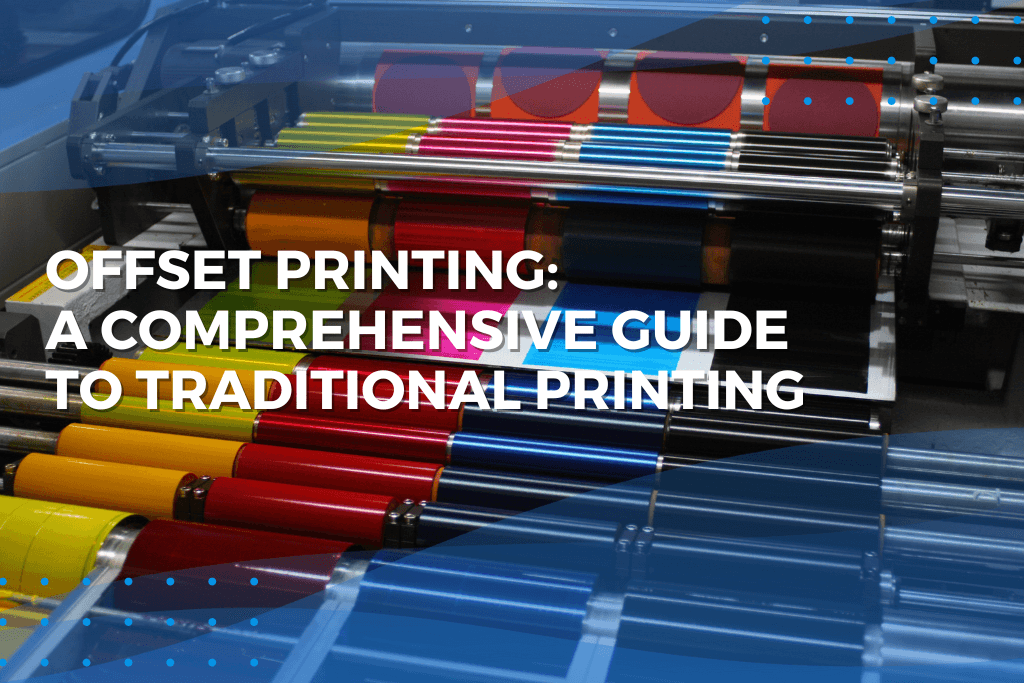
Offset Printing: A Comprehensive Guide to Traditional Printing

By Latest News No Comments

Offset printing has been the backbone of the printing industry for over a century. It remains one of the most common methods used for large quantity print jobs, as it continues to ensure consistent quality and cost-effectiveness. In this all-inclusive guide, we’ll explore the inner workings of offset printing: its history, its mechanics, advantages, disadvantages, and applications in today’s digital landscape.


What is Offset Printing?

Offsetting printing also known as offset lithography is a printing technique where an inked image is transferred, or “offset,” from a plate to a rubber blanket and then to the printing surface. The offsetting technique employs a flat (planographic) image carrier on which the image to be printed gathers ink through rollers, while the non-printing area receives a water-based film called “fountain solution” that keeps the non-printing areas ink-free.


A Very Brief History of Offset Printing

Offset printing actually has its roots in an 1875 UK patent that Robert Barclay submitted for an offset press to print tin plates. The actual modern offset process, however, was invented independently by two different inventors.

In 1903, Ira Washington Rubel stumbled across the basic principle of offset printing when operating his American paper mill. He takes notice that when a rubber cylinder fails to pick up paper for printing, it leaves a clearer image on the next sheet. This becomes the starting point for developing the first offset printing press for paper.

Around the same time, Caspar Hermann in Germany started working on the similar concept. He managed to produce an offset press and started manufacturing it in 1907. All these early inventions led to offset printing becoming the prime form of commercial printing in the 20th century.


How Offset Printing Works

The offset printing process involves a number of key components and steps:

  1. Plates: The image to be printed is transferred onto thin metal plates, generally aluminium. Every colour of a print job requires a separate plate.
  2. Inking System: The plates mounted on plate cylinders in the press rotate, coming into contact with rollers that apply ink and water to them. Water will stick to the non-image areas, whereas the oil-based ink will stick to the image areas.
  3. Offset Cylinder: The inked image from the plates onto a rubber blanket wrapped around another cylinder. It’s an intermediate step, that’s why it’s called “offset” – the image isn’t printed directly from the plates to the paper.
  4. Impression Cylinder: The paper runs through the press and is placed against the rubber blanket by the impression cylinder, which transfers the image onto the paper.
  5. Drying: The printed sheet is then passed through a drying system, depending on the ink used, such as heat, infrared, or UV curing.

For four-colour prints, this cycle repeats once for cyan, magenta, yellow, and black, respectively, commonly referred to as CMYK. The exact combination of these colours makes the full-colour image.


Advantages of Offset Printing

High Image Quality: For that matter, images and type in offset printing tend to be sharper and cleaner because the rubber blanket morphs to the texture of the printing surface.

Cost-Effective for Large Runs: Although the set-up charges can run rather steep, offset printing saves a lot of money with large quantities, thereby suitable for more substantial print runs.

Variety of Materials: Offset presses can print on all types of paper, and any size, and also on wood, cloth, metal, plastic, and much more.

Colour Accuracy: Offset printing provides excellent colour control and consistency-a critical factor in brand identity and high-quality art reproduction

Plate Longevity: The offset printing plates can produce numerous impressions before having to be replaced.

Use special custom-mixed inks: Pantone colours, metallic and fluorescent are only possible on an offset.


Applications of Offset Printing

Offset printing is used to print numerous items, including:

  • Newspapers and Magazines: Mass market periodicals are typically printed on web offset presses that print to large rolls of paper.
  • Books: Many hardcover and paperback books are offset printed.
  • Brochures and Catalogues: Offset provides the best print quality for volumes and inexpensive for large orders, making it the best option for printing marketing products.
  • Packaging: From food packaging to product boxes, offset printing has been employed in various packaging.
  • Stationery: Since most of the business cards, letterheads, and compliment slips are offset printed.
  • Posters and Art Prints: Colour accuracy makes offset the most favourite among artists.


Offset vs. Digital Printing

Offset printing has been the darling of the industry for decades, but digital printing comes with the strength of smaller runs. Compare:

  1. Setup Time and Cost: Digital printing requires less setup and hence cheaper for small quantities. Offset has higher setup but gets cheaper as the number increases.
  2. Print Quality: Offset is more likely to produce higher quality prints, with more smooth colour gradations. Notwithstanding this, digital printing has really improved on its print quality.
  3. Customisation: This is the area where digital printing shines. Variable data printing and personalisation require less flexibility from the offset counterpart.
  4. Colour Accuracy: The colour control is better on offset printing and incorporates special inks rather easily.
  5. Paper Options: More numerous paper stock and materials can be printed on using an offset printer.
  6. Turnaround Time: The turnaround of digital printing is relatively faster, especially when the job is small.


Environmental Concerns

Printers have long been criticised about environmental issues. In fact, offset printing has faced a lot as well. There have been several developments that make this type of printing more environmentally friendly:

  1. Vegetable-based inks: Most printers now use vegetable-based ink instead of petroleum-based ink, thus reducing VOC emissions and easier recycling.
  2. Alcohol-Free Printing: Some printers have given up the fountain solution from containing isopropyl alcohol, which decreases the exhaust of air pollutants.
  3. Computer-to-Plate (CTP) Technology: This simply means that plate making involves using digital data to print the images on the plate itself; no more chemical-intensive film required.
  4. Paper Options: Using recycled paper or paper from responsibly managed forests has become a growing option.
  5. Reduce Paper Waste: Technological advancements and changed methods in setting up and production minimise scraps of paper for disposal.


Off-Set Printing in the Future

Whereas digital printing and online media cover the globe’s surface with communications, offset is still a cornerstone of today’s printing industry. Its potential future rests on meeting changing market needs and technological developments:

Hybrid Printing: A few are already combining elements of offset and digital, allowing offset to do offset and digital to do digital in one print run.

Automation: Automation of plate making, press setting, and quality control reduces waste better and allows for faster setup.

UV and LED Curing: Their advantage is that they allow faster drying times and can be printed on a wider range of materials.

Improved Inks: Sooner rather than later, the ongoing developments in ink technology are improving print quality and the environment friendliness.

Offset printing is integrated into digital workflows, thus offset printing reduces the complexity of production processes.


Conclusion

With such an age-old history and proven track record, offset printing is, without an iota of doubt, a very vital aspect of the printing industry. The ability to produce high-quality prints cost effectively and in quantities that have, over the years, even eclipsed what was considered large ensures it a very significant place in the digital world. How well this technology evolves, solves some of the environmental concerns, and integrates with digital workflows will do wonders for offset printing in yet more changes in business and consumer requirements.

Whether you are a business owner interested in your options for printing, a graphic design student who would love to know more about production processes, or just someone who’s just plain curious about the complex processes that bring magazines and books into your hands, understanding how offset printing works really gives you a lot of insight into one of the most fundamental aspects of our visual culture. And going forward, of course, offset printing will do its part to adapt and to evolve to ensure that it remains a cornerstone of the printing industry.


Need High-Quality Printing for Your Business?VMA Graphics & Print Logo

Contact us today to learn more about our offset printing services and how we can help you achieve stunning results.


Banners and Flags featured image

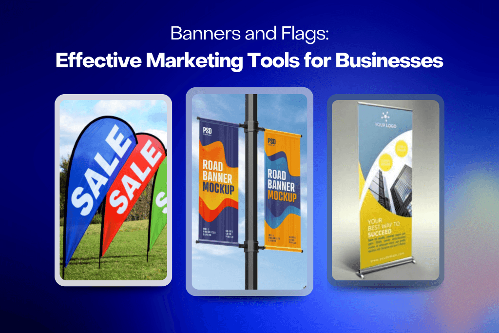
Banners and Flags: Effective Marketing Tools for Businesses

By Latest News No Comments

It is very important to get noticed in business. Companies are always in pursuit of great marketing tools to make their businesses known and remembered by their target customers. Out of all these tools, there are banners and flags, which are extremely versatile and come in handy. In this paper, we trace through the different ways businesses can utilise banners and flags as useful tools for maximum visual exposure, a means to make more customers come, and thereby increasing growth.


What are Banners and Flags?

Before getting to drill deep into their marketing potential, let’s first define what is meant by banners and flags in the business context.

Banners are large, attention-grabbing signs usually constructed from fabric, vinyl, or other rugged materials. Available in a vast array of sizes and shapes-from tabletop banners to mammoth billboards. Typically, most banners feature a company’s logo, slogan, or specific promotional message.

In many ways, flags are like banners, but they tend to also be much more flexible because of their ability to sway with the wind. They can be erected on one’s own or attached to poles and buildings. Company logos, national and local symbols, or promotional messages may appear on the flag.


The Magic of Visual Marketing

Both flags and banners come under the category of visual marketing, which uses images and design to pass messages quickly and effectively. That is the reason why it is such a strong tool: it works fast with a quicker effect because people process more visual information in a shorter time than text, while its visual properties may remind them more than the words themselves.

  • Emotional appeal: The shade, images, or graphics may provoke emotions and a deeper affinity with individuals.
  • Common tongue: Visual adverts almost always speak to every person, ignoring the linguistic language barrier set by any verbal language.


Benefits of Banners and Flags in Business Advertising

With these basics covered, let’s delve into the specifics of the benefits banners and flags hold as a business advertising tool:

1. More Exposure

Banners and flags can be held outside a storefront, at an event, or along a busy street. They are large and colourful and catch the eye naturally. They also serve as beacons in directing potential customers to your business location or booth.

2. Affordable Advertising

Compared to other advertisement tactics such as a TV or magazine ad, banners and flags do not cost much. There’s high yield with money because they can be reused for long periods of time, which makes them a good choice for small, medium, and big businesses alike.

3. Flexibility

Banners and flags are flexible marketing tools.

They can be utilised in different settings:

  • Outdoor advertising
  • Trade shows and exhibitions
  • In-store promotions
  • Special events and openings
  • Sponsorship activities
  • Permanent or temporary signage

This versatility means businesses get value for their money.

4. Customisation Flexibility

The advanced printing technologies give endless flexibility in the customisation of banners and flags for commercial use.

Commercial business has a variety of:

  • Sizes and shapes
  • Colours and designs
  • Materials, ranging from weather-resistant to eco-friendly and the rest
  • Printing, such as digital, screen printing, etc

This customises ensures the message is simply bang on about brand identity and exactly what the intended campaign objectives are.

5. Portability

Many banner and flag designs are light in weight and hence light to transport. This is very convenient, especially for companies that are taking part in many events or need to establish displays across different locations. Pop-up banner and retractable designs are also very popular because of their ease of use and transport.

6. Brand Reinforcement

Banners and flags are often used consistently as branding tools. That is, making use of your logo, colours, and message repeatedly implies that you might just induce brand recognition and recall among the target market. The implications are often increased trust and loyalty eventually.

7. Overnight Impact

Unlike some other marketing solutions, which take time to be effective, the impact of banners and flags comes at once. They begin to work as soon as they are raised to capture people’s attention and communicate your message. This gives more value to such devices in situations where there is a time-sensitive promotion or event.


Compelling Tactics for Using Banners and Flags

Here are some strategies that can help you benefit further from banners and flags for your campaigns:

1. Design is Simple and Clear

While it is tempting to put in as much information as possible, most effective banners and flags have simple, clean designs. Use bold colours, large fonts, and brief messages that a passerby can read and understand from afar.

2. Use High-Quality Materials

Use durable, high-quality materials that will last the elements and mass use. Tatty and ripped banners and flags that fade and give a general look of being old can be very damaging to your brand.

3. Strategic Location

Decide where the banners and flags will be placed. Strategic locations include high-traffic areas, entrance ways, or any other place that is as ‘in-your-face’ as possible. They should not obstruct anything and must be hanging at eye level or above to be seen well.

4. Call-to-Action

Use banners and flags that have a strong call-to-action as needed. Think “Visit Our Store,” “Call Now,” or “Limited Time Offer”. A great CTA will make your audience want to do more.

5. Rotate and Refresh Often

This is just a great marketing tactic by rotation in banners and flags. This usually applies to seasonal promotions or special event marketing. Rotation of banners and flags can also present varied designs to help not lose interest and keep attention on your specific marketing efforts.

6. Other Marketing

Be sure your banner and flag designs enhance your overall marketing strategy. Message, colour, and brand specifics need to be the same in all marketing mediums to build an effective campaign.

7. Local Ordinance Compliance

Prior to installing your banners and flags, especially outside your store, check local ordinances concerning permissible size, placement, and display length. Compliance can help avoid fines and goodwill loss.


Kinds of Banners and Flags for Various Business NeedsBanner flag set

The marketing of different services of any business differs. Some of the very most common kinds of banners and flags are the following:

  • Retractable Banners – These are best for the indoor and outdoor events such as trade shows because they roll up in a compact base to be easily carried away and set up in the requested place.
  • Feather Flags – Long and thin, feather flags are employed outdoors, and their wind-induced movement itself usually attracts the attention of people
  • Vinyl Banners – These are durable, weather-resistant, and remain ideal for long-term outdoor advertising.
  • Fabric Banners – Lightweight, sophisticated fabric banners are ideal for indoor displays as well as premium events.
  • Vehicle Magnets – Removable banners turn company vehicles into moving billboards.
  • Table Throws and Runners – These branded coverings for trade show booths and event tables will give you the polish to your overall presentation.
  • Window Clings – Not only are they simple to apply, but these easy-to-removable banners also find their place on store windows and temporary promotions.


Measuring Effectiveness of Your Banner and Flags

This is the only way to be sure that you really made a good decision by spending money on banners and flags. This can be measured by:

  • Foot traffic – Increase in visits from people in your store and booth when using banners and flags.
  • Sales data – Sales during periods when banners and flags were visible.
  • Customer surveys – Ask your customers how they heard about your business or promotion.
  • Social media buzz: Displays of banners and flags enhance the social media buzz pertaining to the messages on the banners/flags.
  • Photography: Banners – especially unique designs of flags will make people share more on social media.


Conclusion

Banner and flag advertising are highly powerful, flexible as well as low-cost tools for any business to be massively exposed and made well known. Their ability to communicate the message in a short period to make an impression at once makes banners and flags invaluable for every business around the world.

The understanding of the benefits of banner and flag marketing, effective strategies, the type of banners you can buy for your needs, and how to effectively measure their influence will help you tap the full potential of these marketing tools. Whether you need more foot traffic, stand out at a trade show, or reinforce your brand identity, well-designed banners and flags play a crucial role in marketing.

Remember that in today’s cluttered world, what may appear as the most mundane and even archaic type of advertisement, can sometimes be incredibly effective. Strategically placed banners and flags make businesses stand out above the competition and flag down new opportunities for growth and success.


What Graphic Design Will Look Like in 2025

What Graphic Design Will Look Like in 2025

By Latest News No Comments

As digital marketing evolves rapidly, graphic design has been increasingly important. The need for visually appealing content has emerged as a new powerful tool in a race where brands are competing for attention and trying to leave a mark. This article involves major strategies and tactics that business entrepreneurs can leverage in using graphic design to make more impact in today’s competitive market.

A Peep Into Visual Communication’s Future

Just like technology, the world of graphic design is changing at an unseen speed. Rising trends and game-shifting innovations in the visual world will make 2025 a busy year for designers.

Graphic Design Trends to Watch For this 2025

1. AI-Driven Drafting:

Artificial Intelligence is about to change how creativity manifests in design. Hence, the near future will show more AI tools that are capable of preparing basic designs, suggesting colour schemes, and somewhat predicting new trends. This, in turn, will free up designers to take more high-level creative responsibilities.

A photo of a teddy bear on a skateboard in Times Square

Image created via DALL·E for purposes of the blog. A photo of a teddy bear on a skateboard in Times Square

AI tools like DALL·E, Canva, and Adobe Sensei are already being integrated into design workflows. These tools assist in generating ideas, creating drafts, and suggesting colour schemes or layouts. While AI can indeed automate basic design tasks, it’s unlikely that designers will be fully replaced. Instead, AI will complement human creativity by speeding up repetitive tasks.

2. Hyper-Personalisation:

Hyper-personalisation uses AI-powered algorithms to analyse vast amounts of consumer data, enabling designers to create visuals and messages tailored to individual preferences, behaviours, and needs. By 2025, this trend will grow, allowing brands to deliver highly specific and impactful visual experiences that resonate on a personal level.

Hyper-personalisation is already being used in marketing, with companies utilising AI to deliver tailored content. Tools like dynamic creative optimisation (DCO) are examples of how this is applied in digital ads. As AI technology evolves, hyper-personalisation is expected to become more refined and widespread across industries.

3. Augmented Reality (AR) and Virtual Reality (VR):

Actually, the implementation of AR and VR has started in most industries. Graphic design is no exception. Designers are going to create immersive experiences that blur the difference between real and digital-life design. This could be in the form of AR-powered product packaging or VR-based brand experiences and interactive storytelling.

AR and VR have already been implemented in industries such as retail, gaming, and real estate. In design, these technologies are indeed being used to create immersive experiences, such as AR-enhanced product packaging. The trend toward interactive storytelling using AR and VR will likely grow, though the extent of its adoption by 2025 remains to be seen.

4. Ethical Design:

With a surge of social as well as environmental consciousness in society, the growth of ethical design naturally follows. In that light, questions are now being asked of what kind of impact the created work will have on planet Earth and society at the end of it all by designers. This would range from using sustainable materials, promoting diversity and inclusion, and not allowing any damaging stereotypes.

Ethical design is already a growing concern. Many designers and companies are focusing on sustainability, inclusivity, and social responsibility. Examples include using eco-friendly materials, creating accessible websites, and avoiding harmful stereotypes. This trend is expected to continue and expand as consumers become more socially and environmentally conscious.

5. Design Activated by Voice:

Due to the ever-increasing popularity of Voice Assistants like Siri and Alexa, the design-driven voice will be much in use. Designers will need to make the type that one can look upon and interact with through voice commands. It includes breaking it down into simple, intuitive interfaces and using clear typographies.

Voice technology is becoming more integrated into user experiences, especially with the rise of voice assistants like Siri and Alexa. Designers are increasingly incorporating voice interactions into interfaces, but its impact on graphic design is still evolving. Designing for voice interactions will remain a niche area, but its role could expand by 2025.

Upcoming Technologies to Look Out For

Generative Adversarial Networks (GANs): A kind of AI that can ‘dream’ and create hyperrealistic images and data. Application can be done for creating unique and personalised visuals for marketing campaigns or product designs. By 2025, GANs could be widely used to create unique and personalised visuals for marketing campaigns and product designs.

GANs are already being used to create realistic images and are expected to play a larger role in personalised design applications.

Neurographic Design: It is a new space where graphic design combines with neuroscience to aid in creating visuals that would evoke certain emotional responses. Understanding how the brain takes in visual information helps designers create effective and engaging designs.

Neurodesign is an emerging field, and while it’s still in its early stages, its application is expected to grow as research advances.

Biometric Design: During the mainstreaming of biometric technologies—face recognition, fingerprint scanning—designers will have to develop an understanding in relation to their work. This is through the development of user interfaces that are biometrically tailored to individual users.

Biometric technologies are already being integrated into security and personalisation features, but their use in design is still developing.

As we stand at the edge of 2025, there is big time role transformation for designers. Going beyond aesthetic values, designers emerge as architects of immersive experiences, digging deep with the audience. They are the storytellers, emotion engineers, and catalysts for meaningful connections.

The Role of Designers in the Future

Digital interfaces are dominating our everyday life, designers also bear the responsibility of creating visuals that would be informative yet inspirational and joyful. Boundaries between art and technology are getting blurred. A new generation of designers needs to merge their creative process with the latest tools and techniques.

Beyond Aesthetics: The Power of Emotion

Design is no longer a question of aesthetics. Indeed, it is getting more intrinsic, dealing with the psychology of perception—how visuals influence emotions and drive behaviours. Minds may be in great hands when appealing to the subconscious, in which the designer creates not only an appearance but also an emotional touch.

Adaptiveness and Innovativeness

The design landscape is fast-moving with technological advancements, not to mention changes in taste and preference of the human being. Designers have to be adaptable, enthusiastic about exploring new tools and techniques. They can only keep pace with innovation that forces practitioners to stretch the boundaries of their crafts to come up with groundbreaking works.

As design becomes more powerful, so its responsibility does. It is of tremendous importance that this fact is always remembered by the designers, and they act with the amenity of including in their creation, respectfulness, and sustainability. Influence over society is very significant towards design, and designers have the golden opportunity to use this skill in positive directions.

Get Ready for the Future

Wading through this continuously changing landscape, successful designers will have to maintain a plethora of skills; all the way from core proficiency in traditional design principles to in-depth knowledge of emerging technologies and an empathetic, culturally conscious sense. For the latter, designers will also want to make an addition of the last lifelong devotion to learning and professional development.Looking into 2025 and onwards, one might make out that designers come into even greater significance. Understanding the key trends and embracing the challenges of this new era will place designers in leading roles within the field of visual communication and leave an impact on the world.

Conclusion

With digital marketing, graphics have remained key in commanding attention, building awareness of a brand, and engaging an audience. Their execution and realisation will involve businesses in employing visual communication to reach their marketing objectives. Remember, great graphic design is more than just pretty pictures—it’s about creating a consistent and dynamic visual expression that sinks into the consciousness of your target audience. By applying your creativity, technical prowess, and deep knowledge of the brand, you could come up with truly differentiating designs that incite action.

For any visual content, one must always keep in mind the following important principles: The design has to be fit for and appealing to your market.

Know the structure, interests, and problems of your target audience. Share an outstanding story related to your brand through the visuals. Make emotional connections, communicate your message in a clear manner, and make the audience leave with a memorable experience. Maintain a consistent visual identity across all your marketing channels to strengthen and make the message repeat. And, always embrace creativity and new ideas. Be as innovative as you can in making visuals to maintain a leading-edge design. And finally, but not least, measure the effectiveness of your graphic design. Observe metrics like the engagement rate, click-through rate, and conversion rate to find out which are the dos and don’ts. By following these, you will be able to take advantage of graphic design itself among the pressures and leverage your brand, engage your audience, and finally achieve your marketing goals.


Need Brand Design For Your Business?VMA Graphics & Print Logo

Establish a strong and recognisable brand identity for your business. Contact us today to learn more about our branding services and how we can help you achieve your business goals.


10 Inspirational Logo Designs

10 Inspirational Logo Designs from Top Brands

By Latest News No Comments

A logo is much more than just an image; it is literally a brand’s face. This, in turn, is in a world full of numerous products and services fighting for attention from each other, so making a compelling logo makes all the difference between being just another entity standing out or blending into oblivion. This exploration covers the realm of logo design through ten iconic examples from industry leaders. Deconstructing these visual masterpieces will lay bare the keys to a logo’s timeless influence and fan the creative flames for design work yet to come.

But what, then, really makes for an iconic logo? Is it the simplicity of the design or the memorability of its image, or perhaps the abstractness of the concept? The answer lies in finding a balance in mixing these elements. These ten logo designs from industry giants represent the best in reducing a brand’s personality into one striking visual mark. By deconstructing the details behind these logos, we will learn what design principles have made these brands world-renowned and maybe even generate some new insights into logo design.

Let’s explore 10 iconic logos that exemplify these principles:

Nike: The Swoosh

Designed: 1971Nike Logo - The Swoosh

Designer: Carolyn Davidson

Years in use: 1971–present

The Nike swoosh exemplifies truly great minimalist design. Within its simplicity of arching shape, it is recognisable across the globe and speaks of speed, movement, and athleticism. This mark has become synonymous with performance commitment and innovation for the brand.

Apple: The Bitten Apple

Designed: 1977Apple Logo - The Bitten Apple

Designer: Rob Janoff

Years in use: 1977–present (with various redesigns)

It’s a perfect blend of simplicity and intrigue, an apple with a missing bite, which in essence represents knowledge and curiosity. Apple’s logo communicates the philosophy of user-friendly technology. Now, as the years have evolved, so has the design of this iconic brand. It retains the very core essence of innovation and creativity.

Woolmark: The Intricate Swirl

Designed: 1964Woolmark Logo - The Intricate Swirl

Designer: Francesco Saroglia

Years in use: 1964–present

The Woolmark is synonymous with authenticity and class in the textile industry. The swirl shows the intricate natural fibres of wool, while the design, in its elegance, speaks of heritage and craft. For decades, the Woolmark has been a mark of quality one can rely on.

Starbucks: The Mermaid

Designed: 1971Starbucks Logo - The Mermaid

Designer: Terry Heckler

Years in use: 1971–present (with various redesigns)

The Starbucks mermaid logo is a captivating icon that epitomises the experience of a coffeehouse. The mythic siren symbolises the allure of coffee, and the twin tails signify that the company focused on both coffee and tea.

Coca-Cola: The Classic Script

Designed: 1887 (refined version of the original 1886 design)Coca-Cola Logo - The Classic Script

Designer: Frank Mason Robinson

Years in use: 1887–present

This Coca-Cola script is a true classic in typography, hardly having undergone any significant changes throughout its lifetime. Elegant in curve and distinctive in style, the Coca-Cola logo has become etched in popular culture as happiness, refreshment, and American optimism.

McDonald’s: The Golden Arches

Designed: 1961McDonald's Logo - The Golden Arches

Designer: Jim Schindler

Years in use: 1961–present

Probably one of the most recognisable symbols in the world, these golden arches connote fast food, convenience, and nostalgia from childhood. The inverted V shape suggests the shape of an open door, welcoming each customer to the brand McDonald’s.

FedEx: The Subtle Arrow

Designed: 1994FedEx Logo - The Subtle Arrow

Designer: Lindon Leader

Years in use: 1994–present

The FedEx logo is a masterclass of hidden design elements: within the negative space between the letters “E” and “X” is an arrow, subtly signifying speed, precision, and delivery. This ingenious abstraction makes the logo more memorable and resonates with the basic message of the brand.

Ferrari: The Prancing Horse

Designed: 1929 (first used by Enzo Ferrari in 1932)Ferrari Logo - The Prancing Horse

Designer: Based on the emblem of Count Francesco Baracca

Years in use: 1932–present

A black prancing horse against a yellow background is a strong indicator of the Ferrari brand, which conveys speed, power, and luxury. “Cavallino Rampant,” the horse, has quite a history associated with the Italian air force, thereby adding a touch of heritage and mystique to this brand.

UPS: The Understated Bow

Designed: 1961 (original design by Paul Rand)UPS Logo - The Understated Bow

Designer: Paul Rand (1961); FutureBrand (current design)

Years in use: 1961–present (with redesigns in 2003 and 2014)

The brown UPS logo, with its simple shield and the company’s initials in an understated bow, speaks to reliability, efficiency, and trust. The bow suggests tying things together, translating to getting packages delivered safe and sound.

Lego: The Playful Bubble Letters

Designed: 1973 (current version)Lego Logo - The Playful Bubble Letters

Designer: Lego Group in-house design team

Years in use: 1973–present

These playful bubble letters have captured the Lego brand very well. Each of them is so full of fun and colour that they evoke excited feelings of wonder and creativity, part of childhood. Thus, it reflects their commitment to creative play and construction experiences as embodied by the company.

How to make an Iconic Logo?

It’s the visual cornerstone of a brand, capable of evoking emotions, building trust, and leaving a lasting impression. The best logos share several key characteristics: simplicity, memorability, and abstraction.

  • The Power of “Simplicity”

Contrary to popular belief, creating a simple logo is often the most challenging part of the design process. It requires distilling a brand’s essence into a minimal, yet impactful visual. While some logos incorporate intricate details, the most iconic ones are fundamentally straightforward. Consider Coca-Cola, whose elaborate script belies the simplicity of its concept: just the brand name in elegant typography.

Many renowned logos rely solely on text for their power. From the playful curves of Lego to the clean lines of IBM, these word marks demonstrate that typography alone can create a strong and memorable identity.

  • The Art of “Memorability”

A logo’s ability to stick in people’s minds is crucial for brand recognition. The most effective logos often have a single, dominant visual element that is instantly recognisable. Whether it’s the Nike swoosh, the McDonald’s golden arches, or the Starbucks mermaid, these iconic symbols have become synonymous with their respective brands.

It’s essential to avoid creating logos that are too complex or abstract, as this can hinder memorability. The ideal logo strikes a balance between simplicity and distinctiveness.

  • The Importance of “Abstraction”

While it might seem counterintuitive, a logo doesn’t always need to be a literal representation of a brand. In fact, a certain level of abstraction can often be more effective. Apple’s logo is a prime example: a simple, stylised apple with a bite taken out of it. This iconic symbol has little to do with computers, but it’s instantly recognisable and has become synonymous with innovation and design.

Other classic logos, such as the FedEx arrow or the Woolmark swirl, rely on abstract elements to create visual interest and memorability.

The Test of Time

The true measure of a great logo is its ability to endure. Logos that have stood the test of time, weathering economic storms and cultural shifts, are those that have mastered the principles of simplicity, memorability, and abstraction.

Ready to Create Your Own Iconic Logo?

VMA Graphics & Print Logo

We specialise in logo design and branding that captures the essence of your business.

Let’s craft a logo that stands the test of time >

Summary

Logos are almost like business cards in that they are the very first point of contact a brand share with its audience. It’s effectively visual shorthand for the complex ideas, emotions, and values a brand possesses. In other words, it’s something of a silent ambassador—that means communicating identity, personality, and promise, all without a word. This exploration delves into the realm of logo design by way of looking at ten iconic examples that go beyond being visual representations to becoming part of culture.

Essentially, a truly great logo is much more than a merely visual representation—it is a strategic asset with the ability to drive brand perception, consumer behaviour, and sustainability.

Each of the logos analysed in this research serves as a case example to identify the founding principles of design behind successful brand building. It is in grasping these three characteristics—simplicity, memorability, and abstraction—that designers will be able to fashion logos that hook awareness and are retentive.

Diverse web design strategies

Diverse Web Design Strategies

By Latest News No Comments

Web design cannot be underestimated in today’s digitally driven world. The internet has grown to become an international marketplace, a means of social interaction, and a knowledge base. In this era, the demand for diversified and all-inclusive web design has never been greater. Conversely, diversified web design strategies ensure that digital experiences are enriching, accessible, and engaging for each and every person. This article will define what strategies of diverse web design are available, examine their significance and importance, describe the important principles and real-life applications.

The Role of Diverse Web Design

The role of web design goes beyond the creation of a site that looks good; it is about the creation of experience that empowers users out of diverse backgrounds, abilities, and preferences. Diverse web design acknowledges, celebrates this uniqueness of every user, having all of them in a position to flow through and gain advantage from online content.

Inclusion and Accessibility

It means having websites that remain usable by everyone, whether they have disabilities or not. One might say that accessibility actually deals with the huge portion of inclusion—making it possible for people with disabilities to perceive, understand, navigate, and interact on the web.

For instance, screen reader compatibility, alternative text for non-text elements, and keyboard navigation are vital ways of ensuring a website is accessible. Web Content Accessibility Guidelines explain how designers should consider accessibility when designing web content.

Cultural Sensitivity

A diverse audience would then mean catering to users of diverse cultural backgrounds. It shall thus mean being sensitive to cultural differences in design features such as colour schemes, imagery, language, and symbols. Different colours may, for example, mean different things to various cultures, whereby red may mean luck in one culture and danger in the other. To this end, cultural sensitivity will help designers make a website or application more inviting and relative to their users across the world.

Diverse Web Design: Key Principles

1. User-centred Design

UCD is where the user assumes centre stage in the process. This model’s principal idea is to empower the understanding of users’ needs, preferences, and behaviours through research and testing. This will help designers to make intuitive, usable, and pleasurable websites by placing the user in the design process.

2. Flexibility and Adaptability

A diverse web design has to be flexible and adaptive to different use scenarios of the user’s needs and preferences. This comes to mean responsive designs that allow sites to work on various devices and screen sizes. The other way is through changeable options in text size and colour contrast, letting the users set their ideal display condition.

3. Clear and Simple Navigation

Clear and simple navigation is essential for a positive user experience since it finds required information fast and easy, thus reducing frustration and raising satisfaction. This principle especially holds good for users with cognitive disabilities or those who are not so tech-savvy.

4. Visual Hierarchy and Readability

Visual hierarchy refers to the placement of elements on a page, signalling importance. Effective use of visual hierarchy and readability means that users can easily scan the content and get a feel for what it’s about. This comprises an effective way of using headings, subheadings, bullet points, and whitespace.

5. Feedback and Interactivity

Feedback and a number of interactive elements in the website greatly improve user engagement. These can be hover effects, loading indicators, and confirmation messages that give users an idea of the result for their actions. Interactive elements like these should be easy to use and accessible to all users. They might include forms and buttons.

Various Web Design Strategies Applied in Practice

Application of different web design strategies requires practical steps and considerations. Some examples of the application of these strategies in web design are given below:

Accessible Design

  • Making it screen reader compatible: Providing meaningful HTML structure and text alternatives for images and non-text elements, ARIA landmarks improve screen readers’ access to a page’s structure.
  • Keyboard Navigation: All interactive elements—including links, buttons, and forms—should be keyboard-navigatable. This is necessary for the sake of the end-user who might not have the ability to use a mouse.
  • Colour Contrast: The contrast between text and its background colour needs to be great to ensure readable text for users with vision impairments. Colour choices can be checked through tools like WebAIM’s Contrast Checker.
  • Alt Text Images: Provide descriptive alt text for images so that, in the event of any sight-related disabilities, screen readers may communicate what is on the image to the user. This not only improves accessibility but also enhances SEO.

Being Culturally Sensitive

  • Localised Content: Targets the relevant region by adapting content based on language and cultural context. Translation of text is not enough, one needs to adopt local imagery as well as culturally relevant examples.
  • Appropriateness of Design Elements: Colours, symbols, and other kinds of imagery can have negative or positive implications in a culture. Research these or consult with cultural experts to see that design elements are appropriate and respectful.
  • Inclusive Imagery: Pair this with imagery that is representative, inclusive of different races, different genders, age groups, and abilities. This in turn makes all users feel equally visible and valued.

Improving User Experience

  • Responsive Design: Use responsive design to ensure your website looks awesome and functions efficiently across multiple devices, whether desktop, tablet, or smartphone.
  • Usability testing: Testing the usability of the product in a heterogeneous group of users for gaining feedback and detection of bugs. This is essential in ensuring that your design works well with other groups of users.
  • Personalisation Options: Offer personalisation options like adjustable text size, themes, and layout preferences to accommodate different requirements and tastes of the users.

Clear and Simple Navigation

  • Across-the-board intuitive navigation menus should be designed with ease of passage, clear naming, and logical separation. Here, a mega menu will come in handy in websites containing huge information.
  • Breadcrumbs: Do breadcrumb navigation for users to find out their exact location within a website’s hierarchy and easily go back.
  • Search functionality: Create a good search functionality for the ease of users in finding the information they want. Filtering and auto-suggest options could be placed inside the search to enhance user experience.

Improve your brand with VMA Graphic Design & Print! From branding and printing to logo design, website design, and marketing graphic design, our expert team is here to support you 24/7. Contact us today to ensure your projects are inclusive, accessible, and impactful. 


Case studies in divergent web design

Access Features by Apple

Apple is very serious about accessibility. It does have an accessibility section where it showcases a great deal of tools and resources that enable users with certain disabilities to use their products. Beginning from VoiceOver, which provides screen-reading abilities, to magnification and display accommodation, accessible features are put right at the centre of Apple products like the iPhone and Mac, all of which may be accessed and adjusted according to individual needs. This goes further to attest that Apple is keen on ensuring that digital products and services are usable by the largest possible number of persons.

Global Reach of Airbnb

Cultural sensitivity and localisation are well-carried out on Airbnb’s website. In addition to supporting many different languages and currencies, it makes it very easy for people from other countries to navigate the website and comfortably book accommodations. Further, localised content and culturally relevant imagery also make up the display of the experience that welcomes users across the world. By embracing this cultural diversity, Airbnb has been in a position to expand itself to a global audience.

Conclusion

Diverse web design strategies are important in making digital experiences inclusive and engaging. A focus on accessibility, cultural sensitivity, and user-centred design may help designers ensure that websites accommodate a large section of users and display meaningful interactions to all viewers. In this changing digital space, embracing diversity in web design will go a long way to not only enrich user satisfaction but also to sculpt a more inclusive, connected online world.


You may also like:

What is Diversity in Web Design?

The Art of Minimalist Website Design

10 Tips for Choosing a Reliable WordPress Designer

By Latest News No Comments

Looking for a WordPress website designer and don’t know where to start? Trying to solve a problem should not bring you a myriad of new challenges; this is why we have prepared today 10 tips for choosing the right web development Gold Coast company, with the best results and completely stress-free:

1. Know what you are looking for

Before asking a WordPress website designer to provide services for your business, you need to ascertain yourself what you are looking for. Understand your own needs before you start looking for a developer.

One of the first questions you need to ask yourself is – do I already have a design or do I need someone who will work on my front end, too? This will make the difference between a back-end developer and a full-stack developer, who can create a website from scratch or handle a complete redesign.

Next, establish the overall goal of your website, as this will enable you to determine the features and functionality you need. Some websites contain just a few pages, such as home page, about us page, contact page and blog, and have a passive website structure, while others are centred around community interaction and will require different functionalities.

When you need to freshen up the layout, look for someone with front-end design experience. On the other hand, if you are looking to include a large number of features, collaborate with a back-end technical developer.

2. Know the person

Would you trust anyone to build a house for you?

Your website is your business’s virtual home, so you need someone reliable to create it.

Find a real person instead of handing your project to an unknown online service. Although it is a good practice to meet face-to-face with your website designer Gold Coast, it can be perfectly okay if you are having a phone call or a Skype chat to introduce yourselves. Many developers work remotely and even WordPress as a company does not a physical office and its employees are distributed everywhere across the globe.

Make sure the developer is able to answer all your answers and demonstrate he or she is experienced, in person or online, before proceeding further.

3. Check company portfolio

A web development Gold Coast company’s portfolio is a great way to gain access to the type of projects their team can deliver. A reliable developer will give you access to their past work, such as links to live websites or a section on the company’s website with details of past projects and a gallery of screenshots. The second type of portfolio is preferred by many developers because it allows them to present their projects exactly as they delivered them. Live sites can be subject to changes made by customers, and these changes can put the developer in a bad light.

4. Choose someone with relevant expertise

No two websites are alike. One of the easiest types of websites is the business brochure website, which does not require any expertise beside general experience with WordPress development.

However, if your business needs a project narrower in focus, look for a WordPress developer Brisbane with experience in your project’s area. Even if any quality company should be able to figure how to create a niche website, choose an agency or developer with specific expertise that will have deeper insights into your specific activity. For instance, one of the niches that Visual Marketing Australia is specialised in is medical websites – and our approach consists of combining web development with marketing packages to attract high-value patients.

5. Understand developer’s approach

Have you just interviewed a WordPress website designer? You should be able to tell the company’s or contractor’s modus operandi when working on a client project.

Clients who have no clue on where to get started prefer a brainstorming session first. If you are this type of customer, make sure your developer of choice handles strategy and design as well as the engineering part.

Others have an exact idea of what they want and just need someone to make their vision a reality, so they will prefer a different process. They will expect a web development company to understand exactly what they need, follow instructions, and deliver.

6. Check the size of the team

The world of WordPress development companies is a diverse place.

On the one hand, you have freelancers working solo or giving some of the extra work to a friend or a sub-contractor. On the other hand, there are those massive agencies with dozens of employees that handle a large number of projects.

In terms of customer-company interaction, a solopreneur or a smaller development agency offers the benefit of developing a personal relationship between the customer and the team. In larger agencies you’ll almost certainly work through an account manager.

A solution in-between is often preferred by most businesses, as a medium-sized team has the set of skills and time resources for delivering a complex project in a relatively short amount of time. At the same time, they will manage to ensure that personal touch that some customers search for.

7. Ask for references

How do you identify a suitable WordPress development company?

We already know that the majority of people research products and services online, but they are reluctant to make a decision without also having a reference from a friend. A professional WordPress developer can easily provide real customer testimonials and references. If you are not able to talk to a satisfied customer directly, you can also check online reviews on Facebook and Google – forging online reviews on these two major websites is very difficult and you can count on their authenticity.

8. Ask about other skills besides WordPress

Just having someone to create a website for you does not ensure a strong online presence. Soon after your website is live, you will find yourself searching for website marketing Gold Coast services.

Ideally, you should find a developer than can also assist with complementary services aside from making sure your website is always up to date and uses responsive web design. A well-established and experienced digital marketing agency such as VMA can provide a variety of services aside from web development: online video advertising, email marketing solutions, search engine optimisation, digital marketing, mobile app development, CRM systems integration, social media marketing, graphic design and branding, web hosting, and promotional products. Determine what additional services are vital for your business and choose a WordPress website designer or agency that can provide them to you.

9. Ask about maintenance

Having your website designed on WordPress or any other platform is more than just a one-time project. Development companies should provide ongoing service plans and updates in case you want to improve your website content or add new functionality. And you will definitely want to do this! Customers can immediately sniff a website that looks years old and dismiss it as old stuff. Without constant improvement and upgrades on your website, your business will not be credible and potential customers will run away from you the minute they see your outdated designs.

What you need to avoid too is companies that are only interested in building your website and not offering an ongoing support. A reliable and professional web developer will be available to provide continuous support because this ensures complete customer satisfaction and gives them repeat business.

10. Understand your responsibility

No expert WordPress website designer is able to create that stunning website of your dreams without your help. The last piece of advice takes us to the first one, “know what you are looking for”, and closes the circle. Our last tip refers to the fact that you should know exactly what you are responsible for and what the development company is responsible for. In other words, what information do you need to provide to move the project forward? You may be responsible for supplying content or materials for the copywriter, submitting photos, and providing certain details on your expectations from the final result.

Hiring the right WordPress website designer is a big decision because you are choosing your partner in creating your virtual home. Our tips can help you choose a partner that will set you up for success. Whether it’s us or a different agency/developer, we wish you the best of luck!

Sharing is caring!

The post ( 10 Tips for Choosing a Reliable WordPress Designer) appeared first on Visual Marketing Australia.
Source: Source link

Should I hire a Marketing Agency on the Gold Coast?⁣ – VMA

By Latest News No Comments

Without marketing, a business does not really exist. You will fail to attract high value customers if you don’t promote your product efficiently.

Many small business owners do understand they need marketing services, but choose to handle the promotion part themselves in order to save money rather than using a marketing agency Gold Coast or Brisbane for that matter. In this post we will show you that hiring experts to do your social media ad campaigns or Google Ads campaign and other promotion activities is actually more cost-effective than doing it alone.

So, the answer to ‘Should I hire marketing agency on the Gold Coast?’ is ‘Absolutely yes!’ and that’s why:

Benefits of hiring a digital marketing agency

There are only pros when it comes to hiring a marketing agency Gold Coast to promote your business, including:

You benefit from expert services

What is your job and/or set of skills? Do they include marketing with all its strategies and tactics? Even if you are more or less familiar with promotion services, you will not possess the expertise of an entire marketing agency. Visual Marketing Australia, for instance, provides the following services: Web Design & Development, Online Video Marketing, Email Marketing Solutions, Search Engine Optimisation, Digital Marketing Solution/SEM, CRM Systems Integration, Social Media Marketing, Graphic Design Branding, Web Hosting, and Promotional Products, all at the expert level.

You have more time to focus on your business

Outsourcing your marketing services is more time-effective than assigning these tasks to your internal team. Whether you need a social marketing campaign every once in a while, or daily assistance, you will be more satisfied with your work if you can focus on what you are good at instead of squeezing marketing tasks into an already busy schedule.

You can save money

How much value can you deliver by doing your normal work for one hour and how much value do you produce if you do marketing activities for the same amount of time? We are pretty sure that running your business competently brings you more revenue than striving to improve your marketing skills without obtaining the same value. When you draw the line, you will agree with us that hiring a marketing agency Gold Coast is more cost-effective than promoting your business without professional help.

You allow employees to focus on their jobs

The same thing happens with your employees – they are happier and more productive when they do their job. If marketing is not in their job description, don’t ask them to do it because they will feel frustrated and will not be able to do their work properly either.

You enjoy flexibility and low risk

Marketing work is different from production work. Let’s imagine you are implementing right now a massive social media awareness campaign – this may require 100 hours of work this week. But when the campaign is over, marketing will only take 10 or 20 hours of work per week. Having an employee to do this kind of work is far from optimal.

Retaining a marketing agency, on the other hand, is not as permanent as hiring an employee and they can adapt to a fluctuating work schedule. Moreover, a relationship with a contractor is easier and cheaper to manage. If you decide to terminate your relationship with your marketing agency, you need a 30-day notice and payment of any outstanding invoices. Terminating an employee is a far more complicated and costly process.

You can scale up or down whenever you need to

Business can be quite unpredictable. Sometimes a company can grow exponentially in a relatively short time, or it can experience contractions. No matter where your company goes on the scale, up or down, an agency can match the level of work and adapt to your changing size. One of the best parts of using a marketing agency Gold Coast is that you don’t have to hire additional employees to do more marketing when needed. The marketing agency already has a team of people who are ready to step in.

You have access to more tools and resources

Although online marketing is more cost-effective than traditional marketing, you cannot promote a business efficiently with just a computer and a connection to the Internet. Your marketing results and the success of your next social media marketing campaign will also be determined by the tools you use. Subscriptions to these tools and the training costs can quickly add up and even if you spend money in this direction, you might not be getting the most out of these resources anyway.

Agencies, unlike the average user, have staff trained to use these tools and can have their own dedicated representatives on platforms such as Facebook and Google. Accessing the tools and resources you need through an agency is more cost-effective than trying to get there individually.

You will get a fresh perspective on your company

When you’ve been running a business for several years, boredom and complacency can ensue. It is always a good idea to take a fresh look at how things are being done in your company, and a marketing agency can do this for you. The employees of a marketing agency Gold Coast have a more objective take on what should and what should not be done in terms of marketing, without clinging to old ways for sentimental reasons or due to inertia. A marketing agency will be able to give your social media presence the much-needed makeover and produce for you successful social media campaigns.

Your sales will increase

It all comes down to $$ – if your business doesn’t produce revenue, it cannot sustain itself. The main reason why you need a good digital marketing agency is to increase your profits and you will definitely see this happening several weeks after your fresh new start.

Why hire marketing agency on the Gold Coast and not remotely

So, now you have decided to collaborate with an agency to reboot your online marketing. A quick online search will produce hundreds of results from different marketing agencies worldwide. While signing with a remote agency to lower marketing costs can be tempting, we do not recommend it. A local service, such as a marketing agency Gold Coast, will deliver the following advantages:

Knowing your market better

Working with a local agency is more convenient because they already know the Australian market and possibly even your industry or niche.

Understanding local SEO

If your business success depends on your physical location, a Gold Coast agency will be able to implement the best local SEO strategy for you as they are acquainted with the area and already know what works and what doesn’t.

Having the same business hours

Getting in touch with your marketing services provider is easier when they speak the same language and have the same business hours as you. It is also possible to meet the agency’s representatives face-to-face for a more fruitful collaboration and your complete peace of mind.

Supporting the local economy

By using the services of Australian companies, the money you pay goes back into the local economy. You indirectly benefit from that reinvested value by being part of a prosperous community and enjoying better public services.

Reliable customer service

With a local marketing agency Gold Coast, you will never get lost in translation or have to call at odd hours to speak to someone. With customers Australia wide, you can be assured you will get the level of service that only an Australian company can provide.

If you need to contact VMA, you can call, email us, send us a message via the contact form, chat with us, or pay us a visit at 42 Bundall Rd, Suite 17, The Pegasus Centre, Bundall, Qld 4217. You can also book an appointment online (call or meeting of various durations). We are here for you, as long as you need us!


Sharing is caring!

The post ( Should I hire a Marketing Agency on the Gold Coast?⁣ – VMA) appeared first on Visual Marketing Australia.
Source: Source link

Faceless Digital Marketing: A Trendy Strategy – Visual Marketing

By Latest News No Comments

What is Faceless Digital marketing?

Faceless digital marketing means promoting a business without showing any people’s faces. Instead of having influencers or famous people represent the brand, faceless marketing relies only on the brand itself.

The brand tries to connect with customers through its unique style, tone of voice, and messaging, rather than having customers attracted to specific individuals associated with the brand. The goal is for people to like and follow the brand strictly because of what the brand stands for and offers, not because they are fans of particular people linked to the brand.


Key Components of Faceless Digital Marketing

1. Visual Branding

A faceless brand’s visual branding is critical for creating instant recognition. This includes a distinctive logo, intentional use of specific colours/fonts, and an overall visual aesthetic that becomes synonymous with the brand. Photography, graphics, and iconography are carefully designed to reinforce the brand’s look and feel without relying on individual people’s images.

2. Voice and Messaging

The way a faceless brand communicates through written and spoken words shapes its personality. The brand’s tone, language choices, and consistent messaging style across marketing channels allows customers to recognise the brand’s unique voice. This crafted voice gives the brand a human-like persona without being tied to actual persons.

3. Values and Positioning

Faceless brands stake out clear values, principles, and a market positioning angle that differentiates them. By promoting what ideals and customer needs the brand fulfils, allows it to be known for something beyond just products/services. This value positioning replaces the typical celebrity/influencer associations.

4. Brand Story/Heritage

Many faceless brands lean into storytelling about their origins, history, or brand heritage to create meaning. This backstory gives the brand more substance and identity, versus just feeling like a faceless corporation. The brand story replaces a single founder’s story.

5. Mascots or Characters

Using illustrated mascots, animated characters or recognisable design motifs provides faceless brands something visually ownable. These branded figures act as the “face” to personify the brand’s personality traits in marketing communications.

6. Product/Service Experience

For faceless brands, the actual product or customer service experience itself embodies the brand promise. How the offerings look, feel and perform becomes the true “face” of the brand that customers interact with.


Benefits of Faceless Digital MarketingBenefits of Faceless Digital Marketing Infographics

1. Builds stronger brand recognition and loyalty

Without individual personalities dominating, customers focus solely on the brand itself — its values, voice, and offerings. This can breed stronger brand recognition and loyalty over time as the brand identity resonates more deeply.

2. Avoids risks of influencer/celebrity issues

By not tying the brand to any particular people, brands avoid potential controversies or image problems if an influencer or celebrity representative gets embroiled in a scandal or situation that reflects negatively.

 3. Content has longer lifespan

When marketing content focuses solely on the core brand identity — its look, voice, values etc. — rather than featuring specific influencers or celebrities, that content tends to feel more timeless and evergreen. The brand identity itself has more longevity, so content built around it can be repurposed and reused for longer periods without feeling stale.
 4. Allows more flexibility

Faceless brands have the flexibility to nimbly adjust their messaging, visuals, and who they target with their marketing as needed. If consumer preferences shift, faceless brands can evolve their tone, aesthetics, and audience targeting to stay relevant without being constrained by an individual persona’s persona or image they are committed to. This flexibility allows them to be more adaptive.

5. Feels more authentic

For some audiences, faceless brand marketing can feel more authentic compared to influencer marketing that can seem overproduced or disingenuously promoted just because a celebrity/influencer is paid to endorse it. When a brand promotes itself through its own distinctive voice, principles and value proposition — rather than leaning on glammed up influencer sponsorships — it can cultivate more trust and be perceived as more transparent in letting their true brand identity speak for itself authentically.

6. Potentially more cost-effective

Over time, avoiding influencer fees and only marketing the brand itself could prove more cost-effective for maintaining campaigns. The faceless approach allows the brand’s identity, voice, and customer value proposition to be the true stars of marketing efforts.


Examples of Faceless Digital Marketing:

Mailchimp — Their quirky chimp mascot named Freddie and distinctive yellow/black colour scheme are iconic visuals that shape Mailchimp’s brand identity. However, the brand promotes itself through Freddie and its overall fun, irreverent vibe — not by featuring specific Mailchimp employees or founders as the “face.” The chimp character personifies the brand persona instead of real people.

IKEA — The furniture retailer embraces its Swedish heritage and sleek, modern aesthetic as core parts of its brand identity. You see this reflected in their minimalist showroom designs, flat-pack functionality and iconic catalogue. But IKEA promotes these brand traits and its affordable style — not individual designers or executives as the human personalities driving the brand publicly.

Venmo — The payment app’s brand identity centres around a signature bright blue colour, bold typography and a playful hand emoji icon. You see these distinct branded design elements across Venmo’s app, website and marketing — not photos or videos highlighting individual Venmo leaders or paying influencers to be brand ambassadors. The hand motif itself personifies the brand.

Uber — Despite being a hugely visible brand through its app and marketing, Uber is faceless in that it avoids having any one person overtly representing the company’s public image. Even if you recognise their patterned “U” logo and ads showing people using the service, you likely can’t name a specific Uber employee or executive purposely marketed as the “face” of Uber.


Why divert into faceless marketing?

The main reason for using faceless marketing is to build a genuine connection with your audience based purely on your brand itself, not individual personalities. When you do faceless marketing, you are not relying on any influencers, celebrities, or specific people to represent and promote your brand. Instead, all the focus is on communicating your brand’s unique identity, values, tone of voice, and what your brand actually offers.

This allows you to nurture a real, authentic relationship with your customers. They get to know and relate to the true essence of your brand — its personality, principles, and core value proposition. The connection forms around the brand itself rather than being centred on any particular individuals associated with it. Faceless marketing prevents your audience from just becoming fans of a person or being attracted to your brand for the wrong reasons, like an influencer’s popularity. You want them genuinely attached to what your brand fundamentally stands for and provides.


Conclusion

Faceless digital marketing is an approach where businesses promote their brand itself, rather than relying on individual personalities like influencers or celebrities. The focus is entirely on the brand’s unique voice, visual identity, values, and offerings. For businesses, faceless marketing can be really beneficial. It allows more flexibility to freely adapt messaging, aesthetics, and audience targeting as needed, without being tied down to specific people. The brand content also tends to have a longer lifespan since it’s not centred on fleeting personalities.

Perhaps most importantly, faceless marketing helps build stronger brand loyalty and recognition over time. Customers connect with the authentic brand identity and what it genuinely provides, not just glamorised influencer sponsorships. This authentic bond can breed trust and deep brand affinity. Faceless marketing eliminates risks of issues with influencers and may even be more cost-effective long-term. Overall, it allows businesses to nurture real relationships between their product/service and customers through the true brand identity and value proposition alone.


You may also like:

Why Branding Is So Important

Sharing is caring!

The post ( Faceless Digital Marketing: A Trendy Strategy – Visual Marketing) appeared first on Visual Marketing Australia.
Source: Source link

VMA GCGraphics-5 Key Elements to Design a Brilliant Business Brochure -1024x683

5 Key Elements to Design a Brilliant Business Brochure

By Latest News No Comments

A company brochure is a printed paper document that businesses use to tell people about themselves. It’s a way for companies to share important information, talk about the good things they offer, and describe the products or services they sell to customers.

A brochure is usually folded into two, three, or four sections. This makes it different from a flyer, which is a single flat sheet of paper, or a direct mail letter, which is just a letter sent through the mail. It’s also different from a catalogue, which is a much bigger book with many pages showing all the products a company sells. A business brochure is a neatly folded paper document that companies use to advertise themselves, showcase their offerings, and convince people that their products or services are worth buying or using.

5 Key Elements in Designing your Business BrochureBusiness Brochure Sample

1. Informative Headlines

The titles and headings in your brochure should clearly tell the reader what the brochure is about. Use short, simple words that everyone can understand easily. The headlines should grab the reader’s attention and make them want to read more. You can ask a question or make a bold statement with your headlines.

2. Cover Design

The front cover of your brochure is the first thing people will see, so it needs to look attractive and interesting. Use bright colours, big text, and eye-catching images or graphics on the cover. The cover design should represent your business well and make people curious about what’s inside the brochure.

3. The Proper Format and The Appropriate Colours

How you fold and layout your brochure is important for making it easy to read and understand. Use clear sections and spacing, so the information doesn’t look crowded. Choose colour combinations that are pleasing to the eye and match your business branding. Bright colours can make things stand out, but too many colours can be overwhelming.

4. Physical Considerations

Think about the size, paper quality, and finishing touches of your printed brochure. It should be a comfortable size to hold and read. The paper should be thick enough to look professional, not flimsy. You can add special touches like glossy pages or folded pockets to make your brochure seem high-quality.

5. Strong Call to Action

At the end of your brochure, you need to tell readers exactly what you want them to do next – this is called a call to action. Clearly display your business phone number, website, email, and physical address, so people know how to reach you. You can also invite them to buy a product, schedule an appointment, or take advantage of a special offer. This may be followed by your business contact details.

How to Create a Business Brochure?Graphic design Services

Step 1: Identify the purpose and potential customers

Think about why you are making this brochure and who you want to read it.

∙ Clearly define the main goal – is it to sell products/services, promote an event, share information?

∙ Decide who your target audience is by thinking about their age range, interests, location, etc.

∙ Understand what would motivate and appeal to this specific group of potential customers.

Step 2: Write the brochure content

You need to prepare all the words and information that will go in your brochure. But don’t overload with too much text.

∙ Make an outline of all the key points you want to cover in your brochure.

∙ Use simple language that avoids jargon and overcomplicated explanations.

∙ Write brief, concise descriptions and highlight the biggest benefits and selling points.

∙ Have a few people proofread your text to check for errors and clarity.

Step 3: Visuals and graphics

People are drawn to visuals, so choose some eye-catching photos, illustrations, graphics, or icons to include.

∙ Choose visuals like photos, illustrations or icons that directly relate to your products/services.

∙ Use high-quality, high-resolution images for the best printing quality.

∙ Graphics and visuals should enhance and complement the text, not overwhelm it.

∙ Consider using your company’s branded colours, fonts and logo.

Step 4: Brochure folding style

Consider how many panels you need and what fold style will best present your information in a clear, organised way.

∙ The bi-fold style folds in half like a book and works well for simple brochures.

∙ A trifold brochure folds into three panels and allows more space for content.

∙ The z-fold or accordion fold has multiple panels that open out in a zigzag style.

Step 5: Brochure template

To make your life easier, choose a pre-made brochure template. Browse different designs and pick one that fits your branding and message.

∙ Browse pre-designed templates to find styles and layouts you like.

∙ Templates provide a basic structure to make design easier.

∙ Look for templates with the dimensions and folds you want.

Step 6: Customise the template

Take the template you selected and customise it by adding your text, visuals, colours and branding elements to make it your own unique brochure design.

∙ Insert your finalised text content into the template’s text boxes.

∙ Add your specific photos, graphics, logos and branding elements.

∙ Adjust colours, fonts and layouts to fit your branding and preferences.

∙ Use editing tools to resize, reposition and perfect the design.

Step 7: Printing options

Once your brochure design is complete, you’re ready for printing. Decide how many copies you need and choose between digital printing or professional offset printing.

∙ For just a few copies, printing at home or a copy shop may be enough.

∙ For larger quantities, consider professional offset printing for higher quality.

∙ Choose paper stock options like matte, glossy or recycled.

∙ Pick finishes like folding, trimming or adding a coating if desired.

 What is the Importance of Brochure for your Business?Print Mockup

A brochure helps people learn about your company and the products or services you offer. It allows you to get your business name and information out there for potential customers to see and remember. It is something physical and tangible that people can hold in their hands and take with them. When someone picks up your brochure, they are more likely to look through it later and keep your business in mind. A well-designed, attractive brochure can leave a positive impression on readers.

Most importantly, a brochure allows you to increase visibility for your brand. It gives potential buyers something tangible to read, refer back to, and even share with others. Events are an ideal place to distribute brochures and get your business in front of more eyes.

Conclusion

Brochures are extremely helpful for business, especially at big events like trade shows, live gatherings, sales events, and exhibitions. At these kinds of events, you can hand out your company brochures directly to the people attending. People often go to events like these looking for information about different businesses. So, a brochure is the perfect way for your business to introduce itself and tell people what it does.

Having a nicely printed, physical brochure makes your business look very professional and legitimate. If someone picks up your brochure and likes what they see, they may even tell their friends and family members about your company. Word-of-mouth like this can really help spread awareness about your business and bring you more potential customers.

Brochures allow you to share lots of useful information in an easy-to-read format. They help raise awareness about your brand and let your business highlight its key services, benefits, and advantages. The main goal of your company’s brochure is to promote the business and convince potential customers that your business’s products and services are worth considering.

Your brochure gives you the chance to properly introduce your business. You can inform people about what makes your offerings special, valuable, and different from competitors. Highlighting your company’s strengths and capabilities in the brochure can persuade readers.


You may also like:

The Art of Effective Branding and Graphic Design

Logo Design Process: A Basic Guide