There was a time, not too long ago, when “digital printing” was a one-size-fits-all term. You sent a file to a printer, ink hit paper, it dried, and you moved on. But as anyone in the marketing world can tell you, the bar for “good enough” has moved. We are now in an era where consumers are overwhelmed by flat, matte images on their screens and in their letterboxes.
This is where the choice between UV printing and traditional digital methods becomes a genuine business strategy. It’s no longer just about putting ink on a page; it’s about how that page feels in a client’s hand and how long it stays in their memory.
The Science Under the Hood: Why it Matters to You
To understand the value, we have to look at the “dry time” problem. Traditional digital printing—the kind using solvent or aqueous inks—relies on absorption. The ink is essentially a liquid that needs to soak into the fibres of a material or have its carrier liquid evaporate. This is why, if you’ve ever touched a freshly printed poster and had it smudge, you’re seeing traditional digital ink that hasn’t “set” yet.
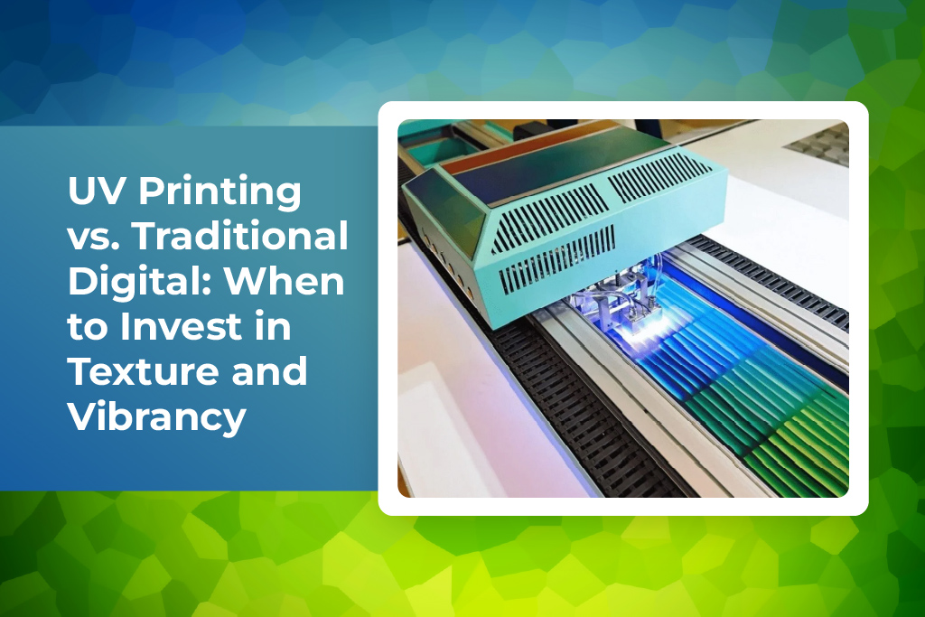
UV printing flips this script entirely through a process called photopolymerisation. Instead of waiting for the air to dry the ink, the printer uses high-intensity ultraviolet lights to “cure” the ink the very second it touches the surface.
This creates a massive shift in what’s possible. Because the ink turns into a solid film instantly, it doesn’t have time to soak into the paper and lose its “pop.” It stays on top, sitting proud of the surface. This lack of “dot gain” is why UV prints look so much sharper—the ink stays exactly where the nozzle put it.
Did you know? The “instant cure” of UV printing actually makes it one of the fastest production methods available. Because there is no degassing or drying time required, a job can go straight from the printer to the cutting table or the delivery van, cutting days off a standard production schedule.
The “Touch” Factor: Why Texture is the New Premium
We often talk about the “visual landscape” (pardon the pun), but we rarely talk about the tactile one. Humans are wired to touch things. When we receive a business card or a product package, our fingers are subconsciously scanning for quality.
Traditional digital printing is fundamentally flat. If you want texture, you usually have to pay for a second process like embossing. UV printing, however, allows for tactile marketing by simply “stacking” layers of ink. By printing multiple passes of clear gloss or white ink, we can create a raised texture that you can feel with your thumb.
Imagine a brochure for a luxury car where you can actually feel the grain of the leather seats on the page, or a wine label where the grapes feel round and smooth against a matte paper background. This 3D effect creates a sensory “hook” that a flat, traditional print simply cannot match. It’s a way to prove your brand’s attention to detail before the customer has even read a single word of your copy.
You may also like:
Colour That Refuses to Fade into the Background
If you’ve ever seen a shop window sign that looks “washed out” after just a few months in the Australian sun, you’ve seen the limitations of traditional inks. Solvent-based inks are prone to fading because the pigments are thinner.
UV-curable inks are built differently. Because they are essentially a cured plastic film, they are incredibly dense. This leads to a level of colour saturation and vibrancy that is difficult to achieve otherwise.
One of the most useful tools in the UV arsenal is white ink. In traditional printing, “white” is just the absence of ink—you rely on the white paper to provide the highlights. But what if you want to print a vibrant logo onto a piece of dark timber or a sheet of black acrylic? Traditional digital ink would just disappear. UV printers can lay down a heavy, opaque white base first, acting as a primer so the colours on top remain “true” and bright.
Printing on… Well, Anything
This is perhaps the biggest “wow” factor of UV technology: substrate versatility. Traditional digital printing is picky. It likes paper, certain types of vinyl, and some fabrics. Try to print a logo on a glass bottle or a metal power bank with a standard inkjet, and the ink will simply bead up and slide off.
Because UV ink is cured by light rather than absorption, it doesn’t care what it’s sitting on. In the last year, we’ve seen a massive surge in businesses customising:
- Promotional Gifts: Direct-to-object printing on metal pens, bamboo lunchboxes, and ceramic tiles.
- Industrial Signage: Printing safety instructions directly onto brushed aluminium or heavy-duty plastics.
- Interior Décor: Custom-printed glass splashbacks for offices or textured wood-grain finishes on MDF furniture.
If the object can fit under the print head and it’s relatively flat, you can likely print on it with UV.
Did you know? UV printing is the primary technology used to create high-quality Braille for public signage. Because the ink can be built up to a specific, consistent height, it allows for durable, weather-resistant tactile lettering that meets strict accessibility standards.
You may also like:
The Sustainability Conversation
We’re all becoming more conscious of the environmental footprint our businesses leave behind. This is another area where the investment in UV pays off.
Traditional solvent printers release Volatile Organic Compounds (VOCs). That “smell” of a print shop? That’s chemicals evaporating into the air. While modern solvent printers are much better than they used to be, they still require ventilation and careful handling.
UV inks are solvent-free. Since they cure instantly through light, there is no evaporation and no gas released into the atmosphere. Furthermore, the shift from mercury vapour lamps to LED UV curing has slashed the power consumption of these machines. For a brand that wants to talk about its “green” credentials, choosing a low-VOC, energy-efficient printing method is a strong piece of evidence to back up those claims.
You may also like:
When is Traditional Digital the Right Choice?
It would be dishonest to say UV is the best choice for every single job. There are still times when the “old way” is the better way, usually dictated by two things: volume and flexibility.
-
Mass Production on a Budget: If you are printing 10,000 basic flyers that people will look at once and throw in the bin, the premium cost of UV ink isn’t necessary. Standard digital printing is incredibly efficient and cost-effective for high-volume, short-term paper products.
-
Extreme Flexibility: UV ink is a cured film, which means it can be slightly more “brittle” than solvent inks. If you are wrapping a vehicle with complex curves and deep recesses, the “stretchy” nature of traditional solvent-based vinyl is often preferred by installers to ensure the wrap doesn’t crack or lift over time.
Key Points to Remember:
- Texture is a differentiator: Use raised UV ink to make your brand literally stand out.
- Durability is built-in: UV prints are naturally scratch and fade-resistant.
- Versatility is king: Don’t limit yourself to paper; consider wood, metal, or acrylic for your next campaign.
- Eco-conscious: UV printing is a cleaner, lower-emission choice for sustainable branding.