
In a world overflowing with choice, where the next click is always a fraction of a second away and the supermarket aisle stretches into an endless mosaic of brands, a product has mere moments to capture attention. This isn’t an exaggeration; it’s the stark reality of consumer behaviour. Whether someone is idly scrolling through an online marketplace on their phone or navigating the crowded aisles of a physical store, your product packaging has roughly three seconds to make an impression. It needs to compel a stop, a tap, or a pickup.
This isn’t about mere aesthetics; it’s about strategic design that functions as your most potent silent salesperson. Effective custom packaging design is the critical intersection of art, psychology, and commerce, directly influencing consumer purchase behaviour and delivering significant packaging ROI. It’s the visual handshake and the tactile experience that communicates value, quality, and brand identity long before a sale is made.
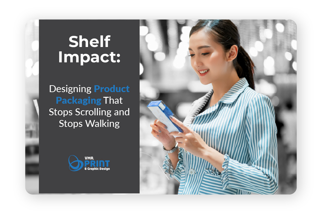
The 3-Second Rule: Your Brand’s Moment of Truth
The ubiquity of choice has trained consumers to be ruthlessly efficient in their decision-making. Faced with overwhelming options, the human brain seeks shortcuts, relying heavily on visual cues. On a digital platform, this translates to rapid scrolling, where only the most compelling thumbnails break the endless feed. In a physical store, it means a swift glance across a shelf, singling out what is distinctive amongst the competitors.
This phenomenon is often termed the “3-Second Rule.” It’s the precious window where your packaging must cut through the visual noise and grab attention. Fail here, and your product remains invisible, regardless of its intrinsic quality or innovative features. Succeed, and you earn the opportunity to tell your brand story, justify your price point, and ultimately, convert interest into a sale. Packaging, therefore, isn’t just a container; it’s the frontline of your brand’s battle for attention.
Stopping the Scroll: Mastering the Digital Shelf
The digital marketplace has fundamentally reshaped packaging priorities. A product primarily experienced as a thumbnail on a smartphone screen demands a different approach than one primarily encountered in a physical store. The challenge here is to create E-commerce packaging solutions that are compelling even when they are not physically present.
Consider the journey of an online shopper. They are likely on a mobile device, often multitasking, scanning search results or social media feeds. Your product appears as a small square, competing with dozens, if not hundreds, of others. This is why thumbnail-ready design is paramount. High-contrast colours, bold typography, and clear product imagery become non-negotiable. The product’s primary benefit or identity must be instantly legible, even when scaled down. Intricate details, subtle textures, and delicate gradients that might shine in person often get lost in the digital ether. Simplicity, clarity, and immediate recognition are the hallmarks of effective online packaging.

Furthermore, the rise of social commerce means packaging now plays a vital role in user-generated content (UGC). The unboxing experience has become a phenomenon, with consumers sharing their product reveals across platforms like TikTok and Instagram. Thoughtful internal packaging, tissue paper, custom inserts, and even the “reveal” sequence itself, transform a simple delivery into a shareable event. Brands that design with the unboxing moment in mind are essentially creating free, authentic marketing content. This extends beyond the product itself to the shipping container—making it durable, protective, and branded without being excessive or wasteful.
Did You Know?
Research from Dotcom Distribution found that 40% of consumers would share an image of a delivery on social media if it came in unique packaging. This highlights the measurable ROI of designing for the unboxing experience.
Stopping the Walk: Dominating the Physical Shelf
While online sales continue to surge, the physical retail environment remains a critical battleground for many brands. Here, packaging must engage multiple senses and withstand the rigours of the retail shelf impact environment. Unlike the digital space, where a scroll takes you away, the physical aisle demands a tangible interaction.
The “Billboard Effect” is a powerful concept in physical retail. When multiple units of a product line are stacked together, their collective packaging should create a cohesive visual block that stands out amidst the fragmented patterns of competitors. This requires consistent branding, complementary colour palettes, and a unified design language across all SKU rationalization. The goal is to create a visual magnet that draws the eye and holds it, stopping the casual walker.
Beyond the visual, tactile branding is a game-changer. The moment a customer reaches out and touches a product, a deeper connection is formed. Think about the difference between a smooth, glossy finish and a textured, matte one; an embossed logo versus a flat print. These subtle tactile cues can communicate luxury, earthiness, ruggedness, or innovation without a single word. Psychologically, picking up a product significantly increases the likelihood of purchase—some studies suggest by as much as 70%. Substrate selection, therefore, becomes crucial; whether it’s recycled cardboard, premium soft-touch paper, or innovative bio-plastics, the material itself tells a story.
Colour psychology also plays a significant role in influencing emotion and perception at the point of sale. Bright colours can convey energy and affordability, while muted tones might suggest sophistication or natural ingredients. The hierarchy of information on the physical pack is another strategic consideration: what is the absolute first thing a customer needs to see to understand and desire your product? Is it the brand name, a key benefit, the flavour profile, or a unique selling proposition? This requires meticulous dielines and prototypes to ensure every element is perfectly positioned for maximum impact.
Did You Know?
Eye-tracking studies in retail environments have shown that consumers spend approximately 60-70% of their decision-making time looking at packaging at the point of sale (POS). This underscores how pivotal visual design is in the final moments before purchase.
The Bridge: Seamless Omnichannel Consistency
The modern consumer doesn’t distinguish between your online presence and your physical one. They expect a unified brand experience, and your packaging is central to delivering this. Omnichannel consistency ensures that the sleek, modern design seen on your website perfectly matches the product unwrapped at home or picked up from a store shelf. Discrepancies here can erode trust and dilute your brand identity packaging.
This consistency extends to communicating brand values. If your brand champions sustainability, then your sustainable packaging materials – such as compostable pouches, recycled content, or reduced plastic – should be evident both in your digital messaging and the physical feel of the product. This visual cue reinforces your brand’s ethos without needing explicit claims on the pack itself. Consumers increasingly look for brands that align with their values, and packaging is a direct expression of these commitments.
Furthermore, emerging technologies are blurring the lines between the physical and digital. Smart packaging, incorporating elements like QR codes, NFC tags, or even AR (Augmented Reality) triggers, allows a physical pack to provide a gateway to rich digital content. A QR code can lead to product information, recipe ideas, a brand story video, or even a virtual try-on experience, enriching the product journey and providing measurable data on engagement.
A Holistic Checklist for High-Impact Packaging
To truly achieve retail shelf impact and conquer the digital scroll, consider this comprehensive checklist for your packaging strategy:
|
Element |
Stopping the Scroll (Digital Focus) |
Stopping the Walk (Physical Focus) |
|
Colour |
High contrast, bold, legible in small formats. Instantly recognisable brand palette. |
Emotionally resonant with product category. Differentiates from aisle competition. |
|
Typography |
Large, clean, legible sans-serifs for headlines. Prioritise clarity on small screens. |
Clear visual hierarchy of information. Consistent brand fonts. |
|
Shape & Form |
Distinctive silhouette in product imagery. Fits digital advertising aspect ratios. |
Ergonomic handling, stackability, and optimal fit for shelf-ready packaging (SRP). |
|
Imagery |
High-resolution, well-lit product shots. Clear depiction of product within packaging. |
Lifestyle imagery (if applicable) that speaks to aspiration. Clear product visibility. |
|
Material/Finish |
Minimised glare for professional photography. Translates texture well in digital mock-ups. |
Tactile branding (e.g., matte, gloss, soft-touch, embossing) that conveys quality. |
|
Information |
Concise, benefit-driven copy. Key information above the digital fold. |
Crucial regulatory info, ingredients, and key selling points clearly visible. Inclusive design for legibility. |
|
Sustainability |
Clearly stated eco-credentials in product descriptions. Visual cues of sustainable materials. |
Use of recycled, recyclable, or compostable materials visible and tactile. |
|
Interactive |
Links to augmented reality, 3D models, or digital experiences. |
QR codes or NFC for extended content, brand stories, or customer support (smart packaging). |
You may also like:
Conclusion: Your Packaging, Your Most Valuable Asset
In the relentless pursuit of consumer attention, product packaging stands as a brand’s most enduring and versatile asset. It’s the silent advocate in a noisy market, the visual storyteller that transcends language barriers, and the tangible representation of your brand’s promise. Investing in intelligent, strategic packaging design isn’t an expense; it’s an investment in your brand’s visibility, desirability, and ultimately, its enduring success.
From the fleeting glance on a smartphone screen to the decisive grab in a bustling supermarket, packaging is the difference between being overlooked and being chosen. It’s about creating an undeniable magnetic force that compels action, whether that action is stopping a scroll or stopping a walk.
Is your packaging truly working hard enough for your brand? Is it optimised for every touchpoint? It’s time to audit your current approach and unlock the full potential of this critical marketing tool.
