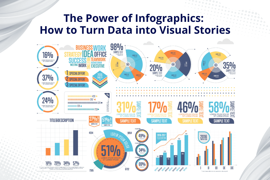
Data floods our digital lives, it is no longer about the extraction but understanding or retaining that extracted knowledge. Infographics are an effective combination of visual storytelling and data visualisation-painstakingly transforming a mess of information into visually engaging narratives that grab your attention and simplify complex ideas, leaving an impression more than most does.
A good infographic can really summarise research very well, summing up much thought work into one picture. One views in which an infographic shines is that it definitely understands to give trends and patterns emphasis. In a world of short attention spans, infographics cut through the barriers because they make the really complex simple to understand.
We’ll talk about the art and science of creating effective infographics. We will dig into the key principles of design, data visualisation, and storytelling, providing practical tips and techniques to help you harness the power of infographics.
What is an Infographic?
It is visual storytelling that exploits the mighty power of images to carry complex information into a rather less complicated and even engaging approach. It’s a richly crafted visualisation that interlocks all those elements with the following.
- Images: These are the most general, using as simple icons, and others as more complicated illustrations helping to represent a concept.
- Charts and Graphs: These numerical representations give straightforward and clear-cut data comparison, trends, and comparisons.
- Minimal Text: Strategic use of words, as the term often engages through short descriptions or labels, makes it possible to maximise the visually rich effect.
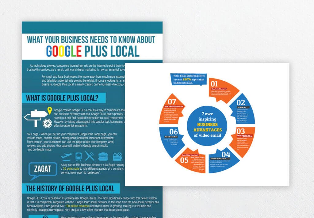
Combining all these elements well, infographics are a beautiful narrative with an aesthetic and informative touch. This style makes it easier for viewers to finally get those key points and remember information, since it’s all so much easier.
Why Are Infographics Powerful?
1. Enhanced Understanding
- Visual Impact: A good infographic can turn the flat, text-based report into a real piece that leaps off the page at one glance and grabs the reader immediately.
- Complexity Made Easy: While a statistical report on climate change may be very complex, an infographic can break out key trends and data points in a way that can be easily understood.
- Improved Retention: According to research, the human brain retains information better when presented in a visual format. An infographic ensures that viewers remember the key concepts more easily.
2. Effective Communication
- Clear and Concise: Because infographics present key messages using minimal texts, they are an effective means of presenting complex information in a clear and concise manner.
- Global Language: Images do not have language, hence infographics provide an excellent means for a multilingual global audience.
- Engaging Display: An infographic would always arouse curiosity over the subject and prompt readers to read more about it.
3. Telling Data
- Storytelling Ability: Infographics makes data come alive. For instance, if one is talking about internet history, it is represented using the timeline of all the major events that occurred.
- Persuasive Power: Infographics can persuade people and bring about actions if done at the right level. The effective use of infographics can be applied to any cause, a product, or educating the public.
Best Examples of Successful Infographics
- Data Journalism: Infographics are used mostly when telling complex data in a lucid manner. One good example of this use is The New York Times, which uses plenty of infographics in visualising most trends in politics, economics, and social issues.
- Marketing and Advertising: Infographics can be used to advertise a product or service, explain complicated information, and tell stories of your brand.
- Education and Training: To present complex ideas graphically engaging. For example, a science teacher will use an infographic to try teaching his students about the water cycle.
- Non-profit Organisations: Show awareness about social issues and raise donations.
Knowing the power of infographics and the guidelines, you can easily create your visually attractive and informational content that will impress your audience and satisfy your goals in communication.
Steps to Create the Most Effective Infographics to Educate, Engage, or Inspire Your Audience
1. Define Your Goal
Identify Your Audience: Who are you trying to reach? Are they experts in the field, or is it a general audience? Understanding your audience will help you tailor your message and visual style. Define Your message, what is the main thing you will want to tell? Limit your message to just a few words or ideas.
2. Gather Your Information
Gather Your Facts: Make sure your facts are accurate, timely, and pertinent. Arrange your information, arrange the information in a coherent and easy to access manner. You may need to use a mind map or outline to explain how the information flows.
3. Choose Your Graphics
Using appropriate form of chart and graph: Use the right graph for your data. For example, use bar charts when one is comparing categories and one want to display trends with time. Design attractive graphics, use a consistent colour scheme and the same font style for your infographic. Further, use icons, illustrations, etc., to make the overall design click.
4. Write a coherent story
Develop a Storyline – organise your information into a coherent narrative, beginning with a strong introduction that leads through the body to a climax, and concludes satisfyingly. Strong visual hierarchy, guide the viewer’s eye through the infographic using visual cues such as colour, size, and placement.
5. Keep It Simple
Use minimal text to write in clear, concise language. Do not use jargon or technical terms that your audience might not understand. Focus on key points and identify the most important information. Use a combination of text and images to drive the point home well.
6. Test and Refine
Get comments or other people’s ideas for changes that need to be made. Ask your friends, colleagues, or potential audience members to look at your infographic and ask for comments. Iterate and refine the infographic by changing details such as colour, font, and layout to increase clarity and impact.
Tools Used in Making Infographics
There are numerous tools that you can use online as well as offline for bringing your infographic ideas into reality. Here are a few popular ones:
Online Tools:
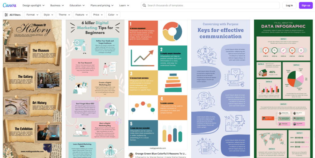
- Canva: All under one roof, with free templates on icons, fonts, etc. Awesome for a beginner and a pro alike. Very user-friendly.
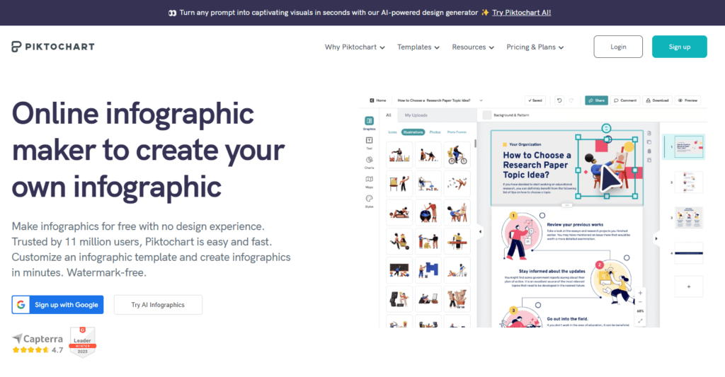
- Piktochart: A cloud-based tool that removes the hassle of an infographic in the easiest drag-and-drop interface.
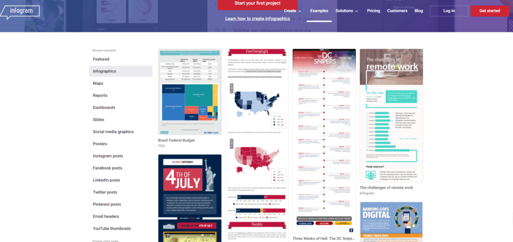
- Infogram: An infographic-making tool that lets you create all sorts of data visualisations in a chart, graph, or map.
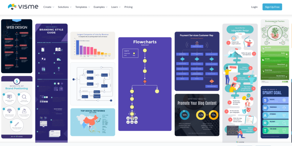
- Visme: Great all-around tool for making interactivity in infographics, presentations, and reports
Offline Tools:
- Adobe Illustrator: The professional-level vector graphics editor will give you the highest amount of control over your design elements.
- Adobe Photoshop: This image editing software is a full-featured one, capable of helping to create excellent infographics visuals.
- Microsoft PowerPoint: Being a general-purpose presentation application, it can also be effectively used for simple infographics.
Another option is to let graphic designers, like GC Graphic Design and Print, take care of the design process for you.
The right decision will make it easier for you to simplify your process of infographic creation and then produce high-quality visuals that express your message.
Conclusion
Infographics represent one of the most influential ways of presenting complex information in a clear and exciting manner. Combining elements like charts, graphs, and illustrations with concise text, infographics make it easier to simplify the presentation of complex data, making it easier to understand and retain. This article will guide you on how to create persuasive and inspiring infographics through its guidelines. Simplicity and clarity blended with a touch of style. That’s how a good infographic is created. Focusing on the story will make for infographics that really make an impression.
You may also like:

